SOME INFORMATION TO THE NEW WEB DESIGNER / MAKER

assignment | preplanning | navigation | storyboarding | basics | turn-offs | remember


Assignment 1 MAA 2003

To make a web site consisting of a Home Page and several other pages. They must all contain text, images and links to the pages within the site plus other links to other websites. 

The topic should preferably be connected to your course or the type of organization you would like you would like to be employued. Examples - A website promoting an Art Gallery, a short film festival, or a photogallery, or even a more personal hobby eg cooking or sport.


top


PRE-PLANNING A WEBSITE


1. Have a clear purpose in mind.

Web sites should have a clear purpose for existing. They should concentrate on a particular theme or topic. The purpose of this web site is to summarize the principles of good web site and page design and to offer links to other sites which cover these principles in greater detail.

2. Know your intended audience.

Often the perceived correctness of a particular interface design is largely dependent on the personal preferences of the individual user. For this reason, an important first step in the design of a user interface is to know who will be using the interface (Lewis and Rieman, 1994). This site is primarily ntended for those people who are new to web site design principles.

3. Have a well structured site.

Many authors mention that a user interface needs to communicate clearly with the intended user. In order to communicate clearly, a user interface should be well organized and structured (Vaughan, 1996).Web pages within the site should have a consistent and predictable
appearance, so that it will be easier for users make sense out of the website. The best approach is to consistently apply a few basic design principles to each web page in the site (Lynch, 1995). Specific structuring principles will be further discussed in the "WWW Page Design" section of this site.

4. Make your site easy to navigate.

If your web site is going to be useful, it must be easy to navigate. Navigation occurs at two levels; within a particular web site and between web sites. Menus are often used to aid navigation within a web site. Menus should be neither too shallow nor too deep and may lose their effectiveness if they don't have at least four or five links (Lynch, 1997). Zimmerman (1997) points out that one way to enhance the navigability within a site is to include navigation aids such as "return to home page", "previous page",and "next page" links on each web page. This not only increases the navigability within your site, but allows users who enter your site on a page other than your home page, to easily find their way around. While you don't have control over other sites, you do have control over the links from your sites to other sites. It is up to you to ensure that these links are pertinent to your site's topic and current.

5. Keep your site current.

The World Wide Web is constantly changing, as new sites are developed and old ones are changed or go out of existence. It is up to you to keep your site current and accurate. Check your links from time to time to be sure that the external sites still exist, and add new links that are pertinent to your site's topic as you discover them.


top


  PLANNING A WEBSITE / NAVIGATION and DESIGN

Look at some sites you like that may be for similar purposes to yours.

Think about colours, images, logos, content and links to other pages in your site as well as other sites.

Draw up a Rough SITE PLAN. Eg.


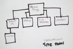
It will show what pages need to have links to other pages.


Add as many pages as you need. You can add sub-pages to others. 

Think about which pages each page should link to.

In a simple site it s good to make a Navigation Bar that is on each page enabling any page to link to any page.

Think about ways to make the site consistent. That is, what elements like logos, navigation bar, images etc are on every page and in the same place.

Perhaps the Home page may be different as it is the First page a visitor will come to and may need some overview and basic content. It will set the ‘tone’ for the whole site.


top


  PLANNING A PAGE / STORYBOARDING
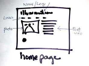
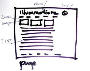
 
  Do a rough SKETCH of each page. Think about images and information you want on each page and possible where it will  be placed on the page. Eg. For the Homepage (or Entry Page, Splash Page or Welcome Page) of Illuminationz Photo Gallery  
 

and do another for all the other pages


Consider using the standard convention of top and left of the page for name, logos, links. If they are at the bottom or the right they may not be immediately seen.


top


  SOME MORE BASICS  


BEFORE BUILDING SITE PLAN YOUR FOLDERS!!
Place all your pages in the one main Folder. (so the they can be easily found)
Images should be in the same folder or placed in their own folder called 'images' which will be in the main folder.
Call your home page 'index.html'.

Call your other pages 'something.html' ie. always with .html after it.

Make these Folders up before you really start working in Dreamweaver. This way placing images and making links etc will happen easily. Dreamweaver and thus the Browsers won't get lost - they will know where to find everything.
Don't change the location of pages and images once they have been set.

FONTS
If you want to use a fancy or unusual font you may have to make it up in a graphic in Photoshop or Fireworks. Remember the webs fonts are limited to what each and every computer viewing your site has in its own list of fonts.  The standard ones are Courier, Arial, Verdana, Times, etc. Less common ones such as Trebuchet and Impact may not be on ALL computers.
Ones like Tall Boys or Old English do not exist on most regular computers' systems so if you are wanting to use that font then make it up as a Graphic.

LINK WINDOWS / HOW LINK PAGES ARE DISPLAYED
Links can be made to erase the current page and replace it with the linked page. OR by placing 'blank' in Target in the Properties Box (near Link) in Dreamweaver it will bring the new page up in a separate window. This can then be exited and you will still be at the original page

LINKS ON IMAGES
Whole or part images can be made to be links.
Whole image - simple select it and in link in the Properties Box define the link.
Using the mapping tool you can define areas on an image to be a particular link. One image can have several links.

IMAGES
Gifs or jpegs. Generally GIFS are for graphics with flat areas of colors. Jpegs are foe photos.

TABLES
Tables can be made to be a percentage of the width of the Browser Screen or a fixed size eg 600 pixels. Percentage widths stretch to fit what ever Browser and what ever size is looking at it.


MAJOR TURN-OFFS IN WEB DESIGN

Below is a short list of some of the things many people find annoying when surfing:

* Excessively large graphics.
* Excessively tiny graphics.
* Too many animations.
* The Blink Tag.
* Requiring the use of plugins.
* Under Construction Signs.
* Bad Color Choice.
* Grammatical and Spelling Errors.
* Text that is too small.
* Text that is too large.
* Having a horizontal scrollbar in 640 x 480.
* Sounds that play automatically.
* Broken images.
* Broken links.
* Too much blank space between sections.
* Too little blank space between sections.
* Using abbreviations in sentences such as u for you.
* Frames that cut off part of a page horizontally.
* The whole page is written in capital letters.
* No paragraph breaks on long pages.
* Too many advertising banners.
* Slow server or too lengthy page.
* Too many horizontal rulers
* Text is hard to read because of colours

The list could go on and on. And everyone has a different opinion. So try not to limit yourself with rules, just try to keep from being annoying! GOOD LUCK!


top


AND REMEMBER

Basic Rules for Usability for Websites and Pages:

Easy to find
Easy to use
Logo top left
Pleasing design
No waiting time
Links obvious / maybe with a rollover
Consistent colors / design
Few clicks to satisfaction / result
No scroll down except when prepared eg information pages
Not getting lost always know where you are and what you are doing
Good clear easily read images / use close ups rather than big wide shots
Scannable short grabs of text
Easy words / not boastful Ð it is not a billboard shouiting at you it s quite personal and quiet and has to create Trust


top

assignment | preplanning | navigation | storyboarding | basics | turn-offs | remember